Mobile UX That Actually Drives Engagement
We help Canadian businesses design mobile experiences that convert visitors into customers. From navigation patterns to performance optimization, we cover everything that matters.

Canadian Brands Building Better Mobile Experiences
From startups to established companies across Canada, teams rely on our insights and frameworks to create mobile-first designs that work.
Enterprise SaaS
E-Commerce Brands
Healthcare Platforms
EdTech Companies
Financial Services
Restaurant Groups
Mobile UX Optimization for High Engagement
Learn the practical techniques that top Canadian companies use to reduce friction and increase mobile conversions.

Building Mobile-First Interfaces That Actually Convert
Learn how to structure your mobile design so users naturally move toward your key goals. We’ll cover layout principles, touch targets, and the one mistake that kills engagement.
Read Article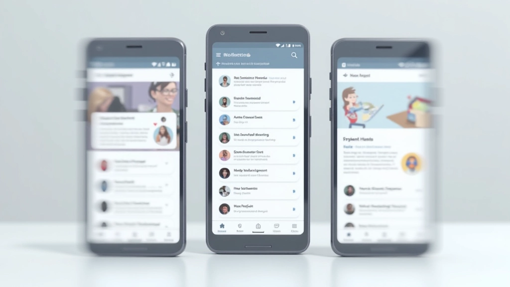
Navigation Patterns That Reduce Friction
Bottom navigation, hamburger menus, tab bars — each works in different situations. This guide breaks down when to use each pattern and how to implement them properly for Canadian audiences.
Read Article
Why Mobile Speed Matters More Than You Think
It’s not just about rankings. Users abandon slow mobile sites within seconds. We’ll show you what’s actually slowing down your site and practical fixes that don’t require a full redesign.
Read ArticleWhat You Need to Know About Mobile UX
We get asked these questions regularly by teams starting their mobile optimization journey.
What’s the difference between mobile UX and responsive design?
Responsive design makes your site fit different screen sizes. Mobile UX goes deeper — it’s about how people actually interact with your site on phones. Touch targets, thumb-friendly navigation, and performance all matter. You can have responsive design without good mobile UX.
How much does mobile speed actually impact conversions?
A lot. Studies show that for every second of delay, you lose roughly 7% of conversions. On mobile, people are impatient — they’re often on spotty connections. Even a 2-second improvement can move the needle significantly. Speed isn’t just nice to have; it’s foundational.
Which navigation pattern works best for Canadian audiences?
There’s no one answer. Bottom navigation works great for apps where users jump between sections frequently. Hamburger menus work when you’ve got lots of options. Tab bars are solid for content-heavy sites. The key is testing with your actual users and watching where they struggle.
Can I fix mobile UX without a complete redesign?
Absolutely. Most improvements come from small changes — better button sizes, clearer forms, faster loading. You don’t need to rebuild everything. Start with what’s breaking your engagement metrics and fix those problems first.
How do I measure if my mobile UX is actually working?
Track metrics that matter: mobile conversion rate, bounce rate on mobile, time on page, and where users drop off. Google Analytics shows you exactly where people are struggling. Don’t just look at traffic — look at what they’re actually doing.
What’s the biggest mobile UX mistake you see Canadian companies make?
Designing for desktop first, then squeezing it into mobile. Mobile deserves its own design thinking. Small touch targets, hidden navigation, and slow loading are the usual culprits. Start mobile-first and build up from there.
Everything You Need to Master Mobile UX
Our guides and resources break down the fundamentals and advanced strategies for building mobile experiences that actually work.
Interface Design
Learn how to layout content, size touch targets, and arrange navigation so users can accomplish tasks without frustration.
Performance
Understand what slows down mobile sites and how to fix it. Real practical steps that don’t require rebuilding your entire platform.
Engagement Metrics
Know which metrics actually matter and how to measure whether your mobile UX is improving. Data that drives decisions, not vanity metrics.
Interaction Patterns
Master navigation styles, form interactions, and micro-interactions that guide users through your site naturally.
Accessibility
Make sure your mobile site works for everyone. Proper contrast, readable text, keyboard navigation — it’s not optional.
Technical Implementation
CSS and JavaScript techniques that bring your mobile design to life. Clean code that performs well on real devices.
Built by People Who’ve Done This Work
We’re not theorists. We’ve designed and optimized mobile experiences for dozens of Canadian companies across different industries. We’ve seen what works, what doesn’t, and why most mobile UX efforts fail halfway through.
This resource exists because we got tired of seeing companies spend money on mobile redesigns that didn’t move the needle. We’re sharing what we’ve learned — the patterns that actually work, the metrics that matter, and the common mistakes that waste time and money.
Whether you’re starting from scratch or improving an existing mobile experience, you’ll find practical guidance here. No fluff, no guessing — just what we’ve tested and what we’ve seen succeed.

Why Mobile UX Matters Now More Than Ever
The numbers tell the story. Mobile isn’t a side project anymore — it’s where your users are and where your conversions happen.
of Canadians access the internet via mobile phone. If your site isn’t optimized for mobile, you’re excluding most of your audience.
is the average time users wait for a mobile page to load. After that, abandonment skyrockets. Performance isn’t optional.
of mobile users abandon sites that don’t load properly or feel slow. One bad experience and they’re gone.
of conversions on mobile come from sites with thumb-friendly design. Layout matters as much as content.
How We Approach Mobile UX Optimization
We don’t just hand you a checklist. We walk through the actual process we use when improving mobile experiences for real companies.
Analyze Your Current Mobile Experience
We start by understanding what’s actually happening on your mobile site. Speed tests, user behavior analysis, and identifying where people drop off. Data first, assumptions second.
Identify Friction Points
Not every problem deserves equal attention. We pinpoint the specific issues actually costing you conversions. Bad navigation? Slow loading? Confusing forms? We find it and prioritize.
Design & Test Solutions
We propose specific improvements based on proven patterns. Then we test them. Sometimes the obvious fix isn’t the right one. We iterate based on real user behavior.
Implement & Measure
We don’t just hand off a design. We make sure it gets built properly and we track the actual impact. Did conversions go up? Did bounce rate improve? Numbers tell the truth.
Ready to Improve Your Mobile UX?
Whether you’re starting from scratch or fixing an existing mobile experience, we can help. We’ve worked with companies across Canada to build mobile experiences that actually drive results.
Get Started TodayFree consultation to assess your current mobile UX
Practical recommendations you can implement immediately
Ongoing support as you optimize your mobile experience